Design System
A journey towards cohesion.
The Challenge
Although Healthwise had many established design decisions - fonts, colors, icon approach, and a few best practices- there was no common source of truth for designers, content strategists, and developers. We were beginning a new suite of interconnected products (as opposed to the older, siloed legacy products) and hiring a new product designer and UX researcher.
Past efforts to develop a design system had been met with resistance from engineering leadership. This time we took a grassroots approach with all design staff buying in and key front-end developers from engineering.
Working On It
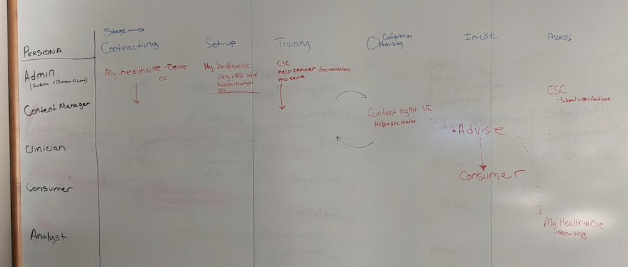
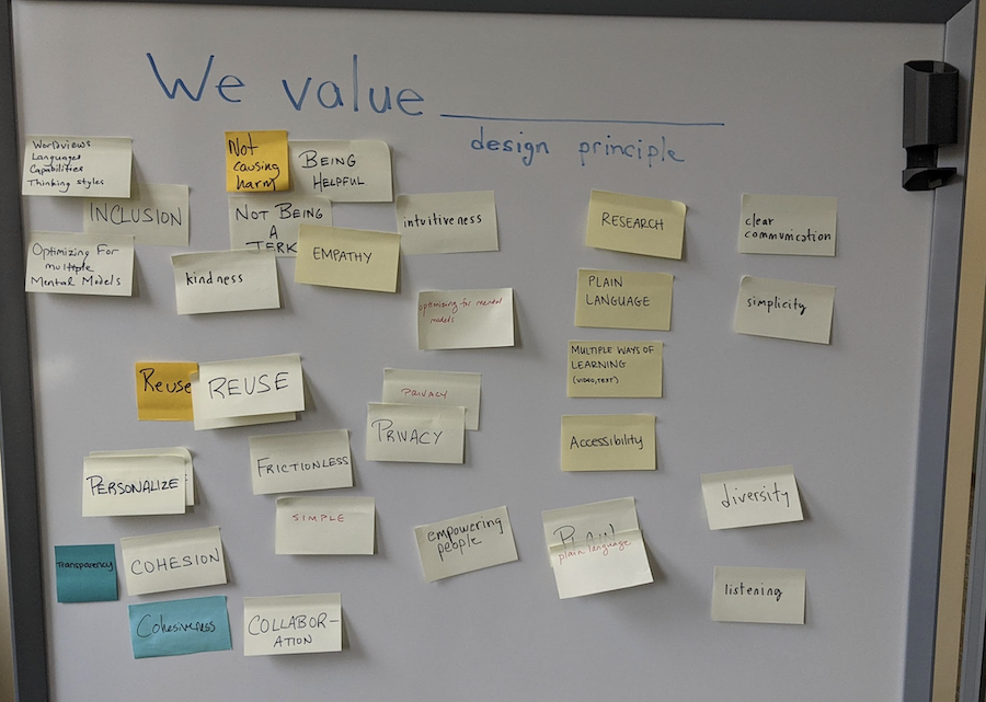
We kicked off the project by reviewing the personas using our new product suite, noting overlap spots and some of the unique needs of each product or persona from a design library perspective. We also identified our values as a UX Team.
Our efforts to align on a design system coincided with a group decision to move to Figma. We could create our UI library in Figma and document it - with examples for use, code snippets, and accessibility guidelines - in Zeroheight. The two connected nicely and allowed multiple contributors.
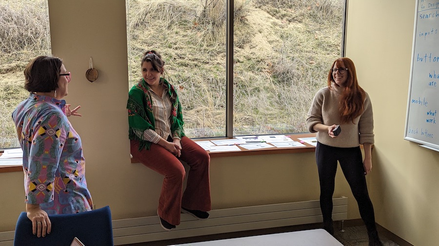
I made sure to schedule time during our semi-annual in-person UX retreats to tackle more challenging issues. The core of our system was a weekly design system meeting that I led with the three product designers, including myself. During these meetings, we discussed upcoming tasks for our products and their associated components. We also divided up responsibilities for research and documentation.
Search, For Example
Search is a critical interaction for a company that offers content. If we have content available but the user cannot find it, it is as good as non-existent. The design team prioritized search in our efforts to unify our components.
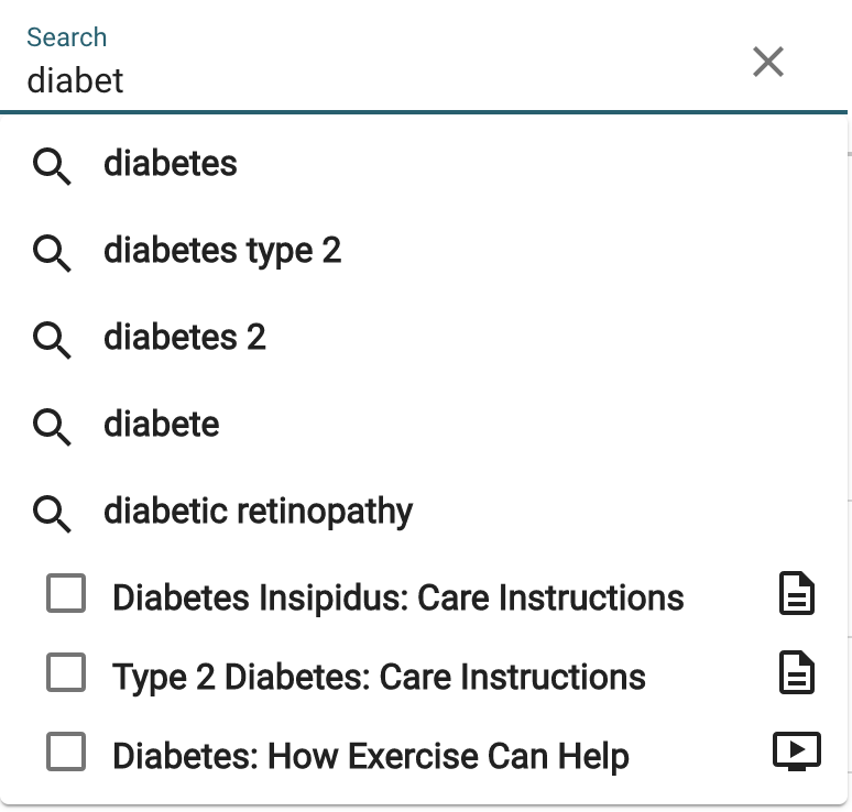
We focused on information scent, accessibility, and usability. We reviewed search components used by other companies - taking ideas we felt were interesting and testing the prototypes with different users and in different products.
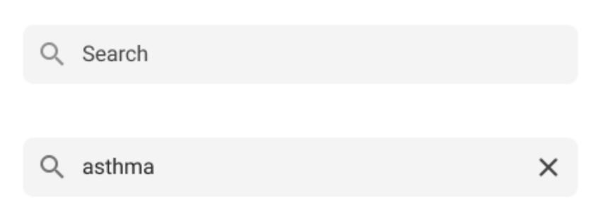
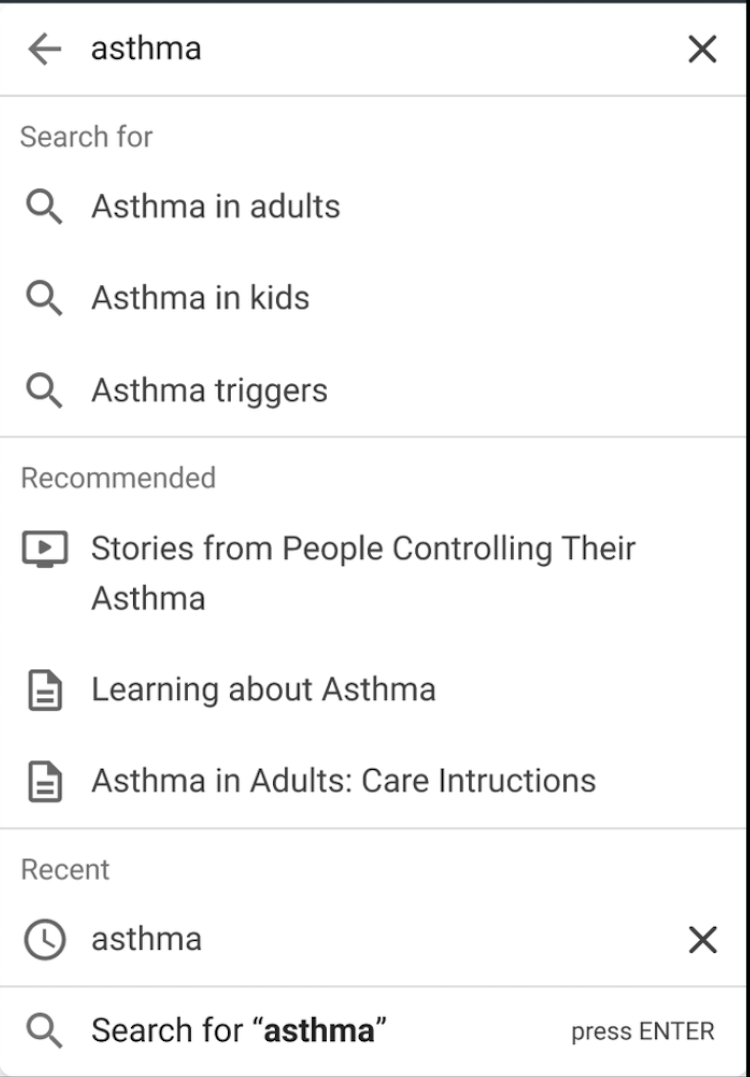
The updated Search component is improved across the board - from the information scent of the magnifying glass on the left to the clearly labeled sections and calls to action. All sections are optional, and each product's team or designer can choose the sections that make sense for them.

Dropdowns, Another Example
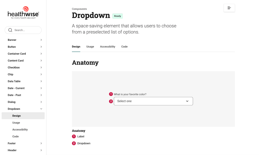
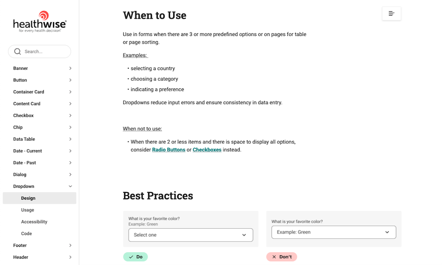
Choosing from a list of items is another common interface task. There are so many ways to accomplish this - radio buttons, toggles, drop-downs, drag and drop... Inspired by the article, A better segmented control by Runi Goswami on Medium, we were working on our decision tree for when to choose which component. The following images show a little of our thinking about when to use dropdowns.
My Role
Weekly Meeting Facilitation
Monthly Meeting Facilitation
Accessibility Research
Content Strategy Liaison
Content Template Responsibility
Documentation
Tools Used
Figma
Zeroheight
Team
3 Product Designers
1 Lead Front-End Engineer
3 Content Strategists
Consult with additional Front-End Engineers, QA, User Researchers, Design Strategist, Product & Design Director, Engineers as needed
Result
Our products were being created collaboratively, with each part complementing the others. Developers had a central resource for code snippets and accessibility information. We were able to concentrate on improving high-impact components as a team and envision how they would develop over time.
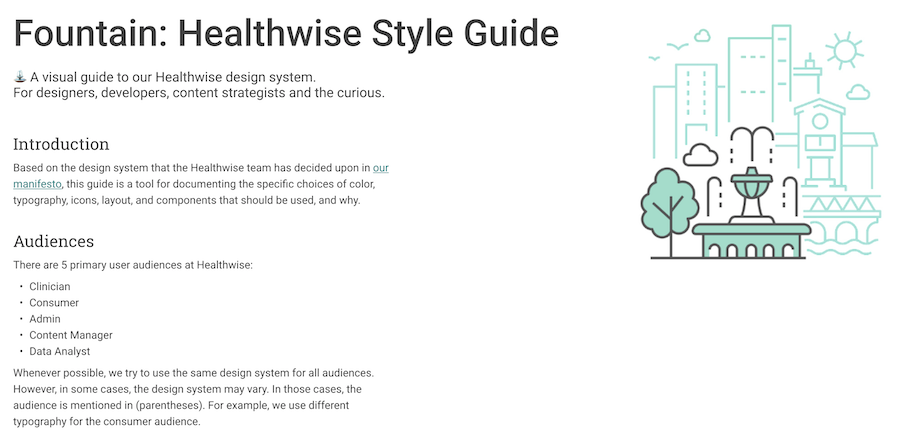
Product Managers were appreciating our efforts, and we were beginning to woo over even the management of the Engineering staff. We witnessed groups outside our team referring to Fountain in meetings and using it as the source of truth. Our team was driving towards a version-controlled software product to be used throughout the company.